

My Role
UX Designer and Researcher
Duration
8 Weeks
Tools
Figma, Photoshop, Illustrator
Challenge
The existing Illini Bus app and website faced usability and discoverability issues that hindered user engagement. Navigation was confusing, and key information was difficult to find due to a disorganized structure. Limited SEO visibility reduced reach, while the app’s cluttered interface and lack of personalization made onboarding and regular use frustrating for new and returning users.
Results
The redesigned Illini Bus app successfully integrated Google Maps' user-friendly interface and real-time tracking features, providing users with clear, efficient navigation and up-to-date bus information. The simplified, intuitive design was well-received by users, improving overall satisfaction and ease of use, while reducing confusion for both regular and first-time users of the bus system.
01 · Research & Discovery
The Objective
Goals
01
Create an intuitive app that makes it easy to find routes, stops, and real-time bus updates.
02
Simplify navigation and information hierarchy to find key features in fewer steps
03
Improve visual clarity, contrast, and accessibility to support usability across varying conditions.
Impact
01
Students found it easier to identify active routes and understand real-time updates.
02
Clearer hierarchy and consistent icons increased trust in the app’s tracking.
03
Streamlined navigation reduced confusion and improved task completion speed.
User Personas
Designing for real people, with real needs.
Competitor analysis
OneBusAway
Strengths
• Easy & customizable stops
• Real-time arrival information for buses
• open-source, allowing for adaptations
• Used in across the country
Weaknesses
• The interface feels very outdated
• Occasionally has inaccurate data
• Limited coverage in particular areas
Transit
Strengths
• Includes different modes of transporation
• Very intuitive interface
• Gives step by step directions for trip planning
• Provide real-time updates
Weaknesses
• Requires a subscription in order to use certain features
• Not available in smaller cities
• Can cause people ot feel overwhelmed due to options
Apple Maps
Strengths
• Offers different modes of transit including walking
• Provides step by step instructions
• Works all across the world
• Integrates well with iOS
Weaknesses
• Difficult to customize the transit options
• Not as updated on real-time bus schedules
• Only provides more general navigation

04 · Prototype & Test
How Might We…
1
How might we provide personalized routes to fit the user schedule?
2
How might we design a user-friendly interface that would allow for efficient navigation?
3
How might we simplify navigation for those that are unfamilar with the bus stops?
4
How might we reduce the amount of steps needed to find necessary information?
5
How might we allow users to pin their favorite stops and places?
Bus Stop Options
They only provide the bus stop options, making it hard for new users to use as they don't know where the stops are.


Unclear Direction
You can't search how to get from place to place making just looking at bus stops very useless.
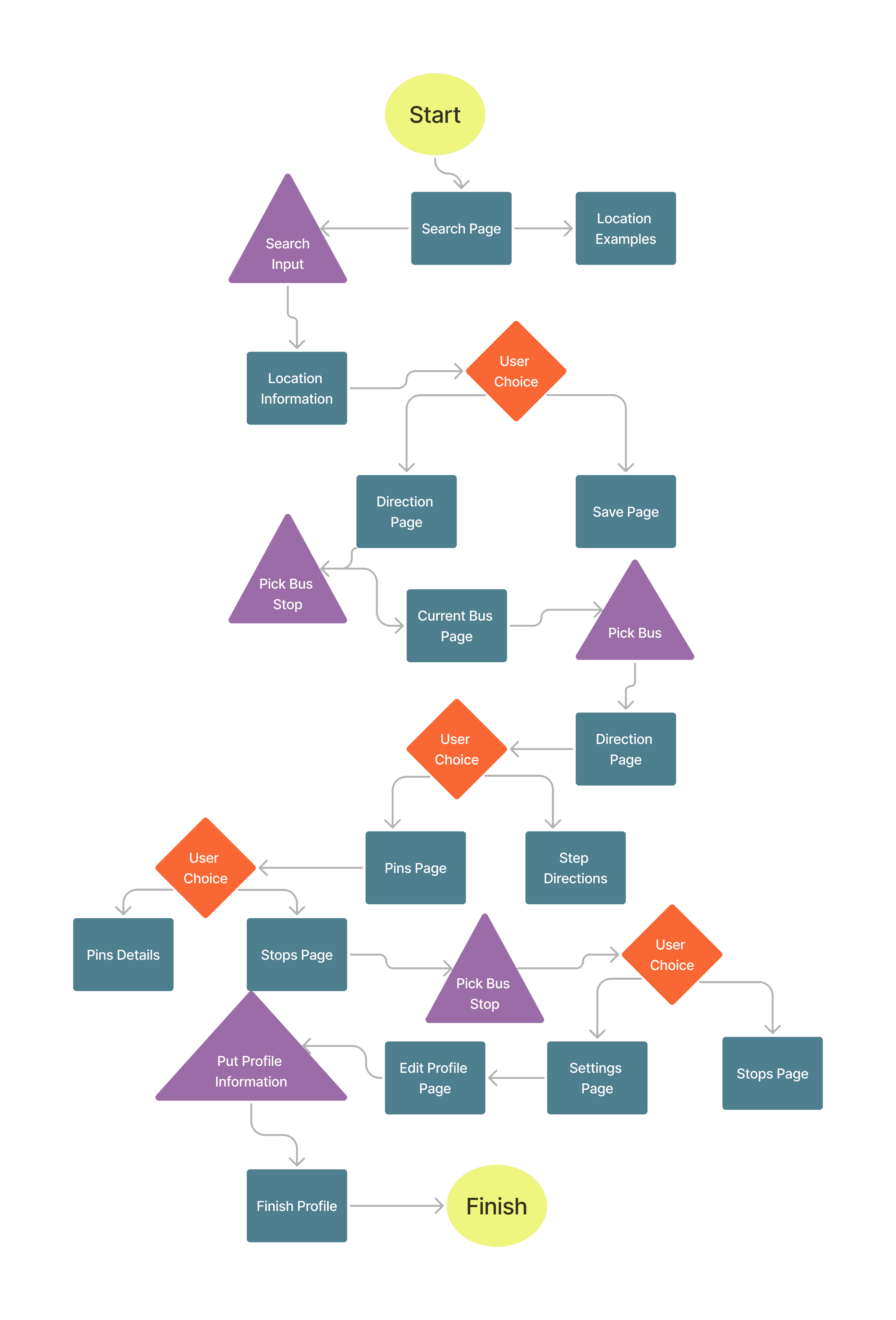
User flow
Wireframes

mockup


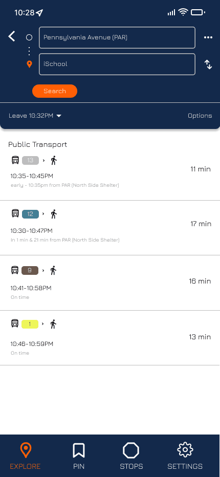


prototype
Takeaways
01
Two users, one intuitive flow
Students navigating on the go and less tech-savvy commuters needed the same app to feel effortless. Balancing speed for one with clarity for the other pushed every decision toward simplicity.
02
Color and hierarchy do the heavy lifting
Route color-coding and simplified tab navigation weren't just visual choices — they were the difference between a confusing map and a confident commute. Structure reduced cognitive load more than any single design element did.
03
Trust in live data isn't automatic
Dynamic status indicators and transparent real-time feedback moved users from skeptical to reliant. Designing for uncertainty turned out to matter more than designing for the ideal case.
04
Testing reveals what polish hides
Peer usability sessions surfaced real friction around notifications and dense map overlays that the prototype never exposed. The most valuable design decisions came after watching people struggle, not before.
Back to Top